Table of Contents
- Getting Started
- The Interface
- Map Panes
- METAR Detail Panes
- Editing & Customizing Panes
- Dashboard Templates
- Saving & Loading Dashboards
- Sharing Dashboards
- Favorites
- Weather Alerts
- Live Air Traffic (ADS-B)
- Accounts & Subscription Tiers
- TV Apps (Fire TV & Android TV)
- Mobile View
- Appendix A — Flight Categories
- Appendix B — Keyboard & Controls Reference
- Appendix C — Troubleshooting
1. Getting Started
MetarBoard Pro is a full-screen, multi-pane weather dashboard that displays every METAR-reporting station worldwide, color-coded by flight category. It runs in any modern web browser at metarboardpro.com.
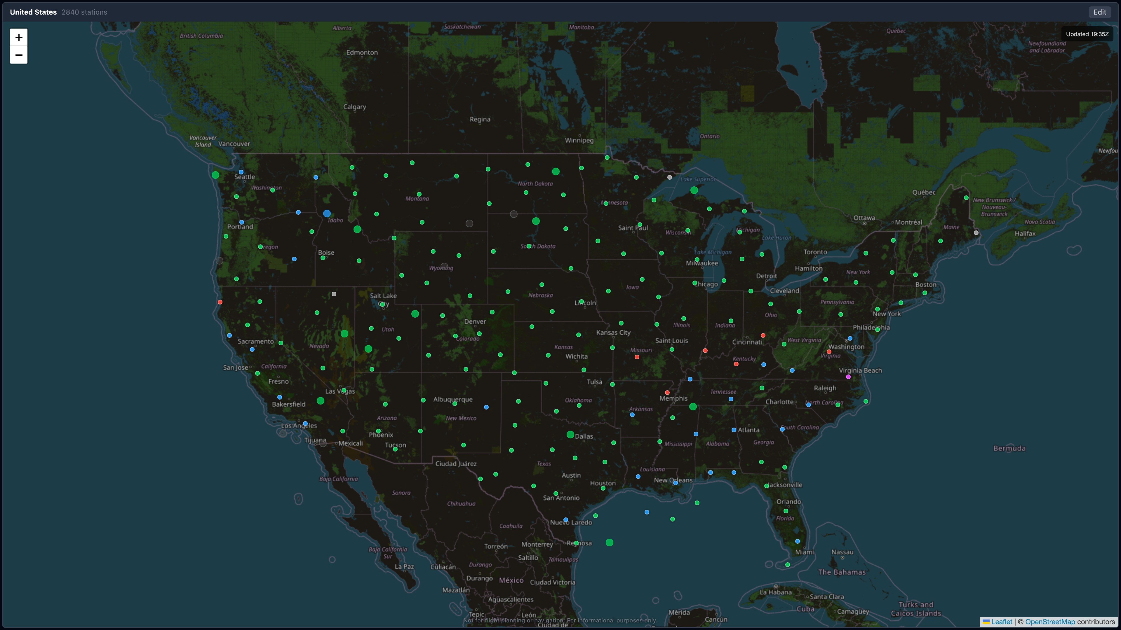 Full US overview in dark mode — every dot is a METAR-reporting station, color-coded by flight category. The “Updated HH:MMZ” pill in the top-right confirms the page is polling live data.
First Launch
When you open MetarBoard Pro for the first time:
- A single map pane loads showing stations across the United States.
- A brief onboarding walkthrough highlights the key toolbar controls (desktop only).
- You start as an anonymous user with access to 2 panes and basic popups.
Tip: Sign in to start a free 14-day trial with full Pro features — no credit card required.
2. The Interface
Desktop Layout
The toolbar spans the top of the screen with the MetarBoard Pro logo on the left, the flight category legend centered, and control buttons on the right. Below that, your panes fill the remaining screen space.
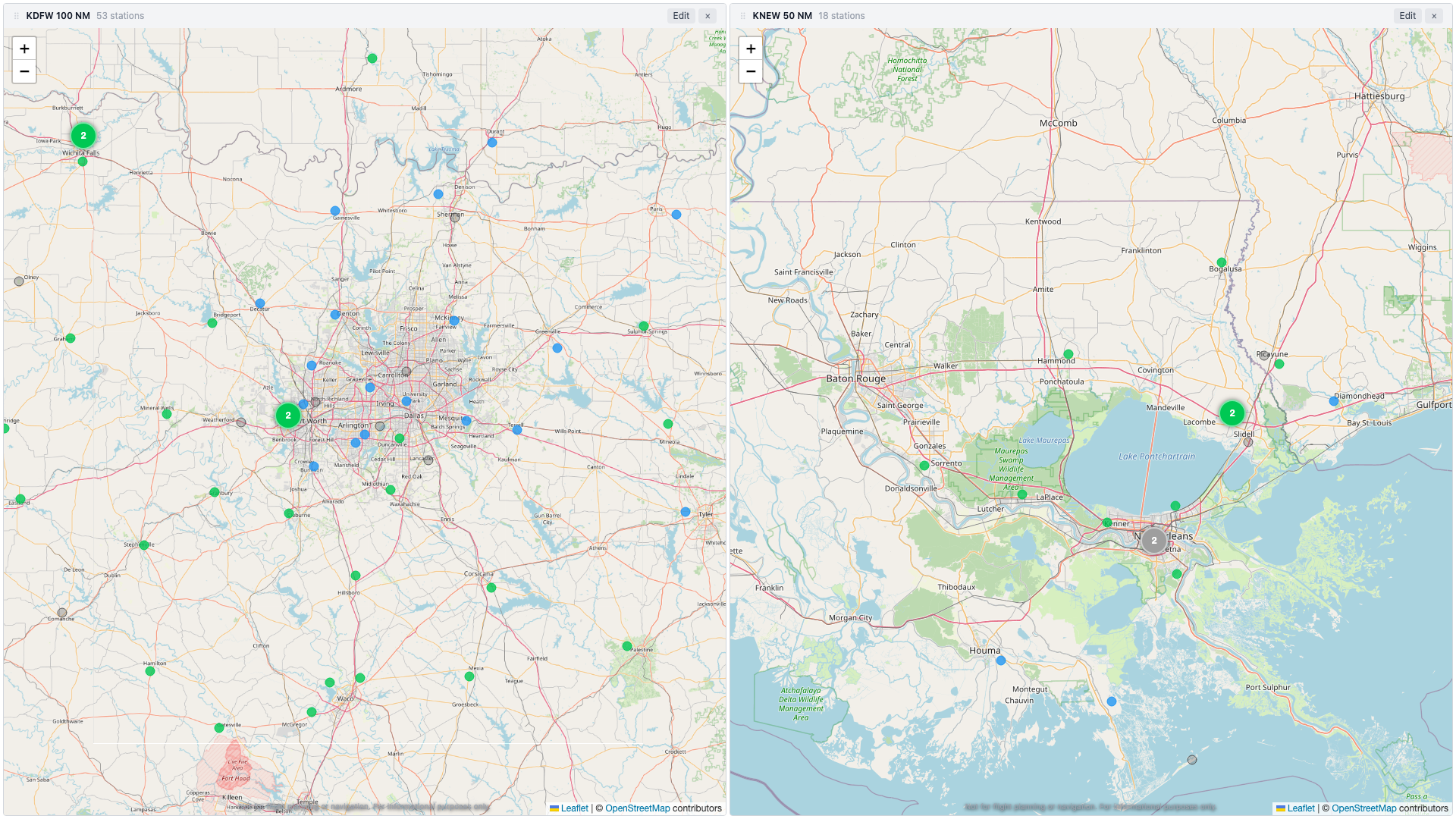 Two-pane layout in light mode — DFW radius view (left) and New Orleans radius view (right). Note the toolbar with pane labels, edit buttons, and controls.
Toolbar Controls (left to right)
| Control | Icon | Description |
|---|---|---|
| Pane Count | [2] | Number of active panes |
| Add Pane | + | Add a new map or METAR detail pane |
| Lock / Unlock | lock icon | Toggle edit mode on/off to prevent accidental changes |
| Fullscreen | expand icon | Enter kiosk mode — hides toolbar, maximizes panes (Pro) |
| Theme | sun/moon | Switch between dark and light mode (Pro) |
| Save | disk icon | Save current dashboard to your account (Pro) |
| Load | folder icon | Load a previously saved dashboard (Pro) |
| Templates | grid icon | Browse and apply pre-built dashboard layouts |
| Favorites | star | View and jump to your favorited stations |
| Alerts | bell | Configure weather change notifications |
| Share | link icon | Copy a shareable URL for your dashboard |
| Apps | phone icon | Links to MetarBoard Wind and TV apps |
| User Menu | avatar | Sign in, manage subscription, settings |
Legend
Centered in the toolbar, the legend shows the four flight categories:
- VFR — Green
- MVFR — Blue
- IFR — Red
- LIFR — Magenta
- UNKNOWN — Gray (data unavailable)
- Stale — Faded/gray (observation older than 90 minutes)
Dark & Light Themes
MetarBoard Pro supports both dark and light themes. Toggle with the sun/moon button in the toolbar (Pro feature).
| Dark Mode | Light Mode |
|---|---|
|  |
3. Map Panes
Map panes display METAR stations as colored dots on an interactive map.
Station Dots
Each dot represents a METAR-reporting airport, colored by its current flight category. At lower zoom levels, nearby stations are grouped into clusters. The cluster color reflects the worst flight category in the group — but only categories with at least two stations drive the color, so a single isolated outlier won’t paint a 150-mile-wide cluster the wrong shade. Stale stations (those that haven’t reported in over an hour) are excluded from the cluster color calculation entirely.
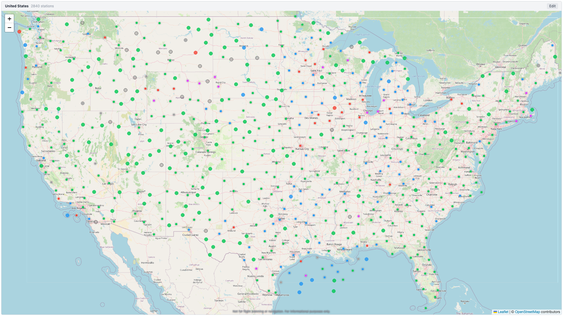
Station dots and clusters across the US in light mode. Green = VFR, blue = MVFR, red = IFR, magenta = LIFR.
Interacting with the Map
| Action | Result |
|---|---|
| Click a station dot | Opens a popup with METAR data |
| Click a cluster | Zooms in to reveal individual stations |
| Scroll / pinch | Zoom in or out (half-step increments) |
| Click + drag | Pan the map |
Station Popup
Pro / Trial users see the full popup:
- ICAO identifier and flight category badge
- Day/night indicator (sun or moon icon)
- Raw METAR text
- Decoded fields: ceiling, visibility, wind, altimeter
- Observation age (turns orange >60 min, red >90 min)
- Star button to add/remove from favorites
- ”+ Add METAR Pane” button to open a detail pane for this station
Free / Anonymous users see a minimal popup with the ICAO code, flight category, and an upgrade prompt.
Wind Arrows
When you zoom in to level 6 or closer, animated wind particles appear at each station showing wind direction and speed.
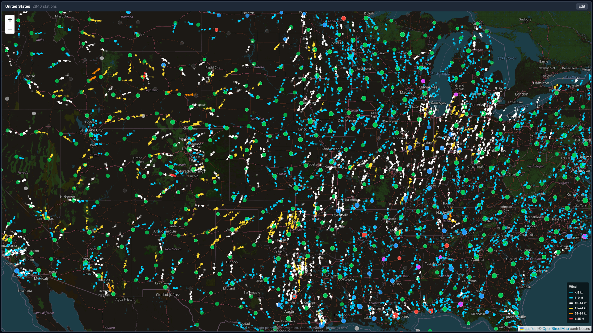 Zoomed in with wind arrows enabled — animated particles show wind direction and speed at every station. Colors indicate wind speed intensity.
Particle colors indicate speed:
| Color | Wind Speed |
|---|---|
| Cyan | Calm |
| White | Light |
| Yellow | Moderate |
| Orange | Strong |
| Red | Extreme |
A wind legend appears in the bottom-right corner of the map when wind arrows are visible.
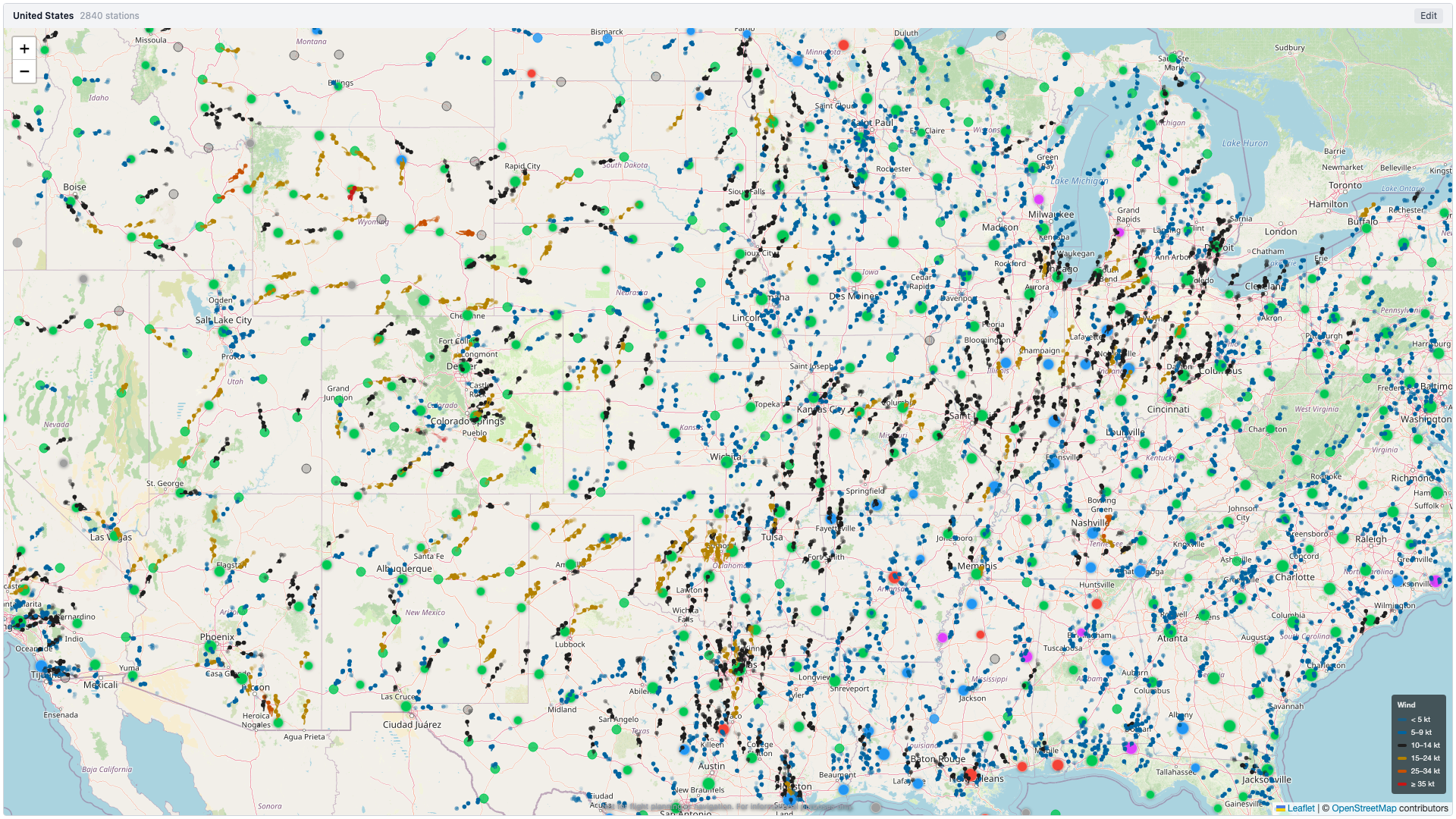 The same wind visualization in light mode. Note the wind speed legend in the bottom-right corner.
Refresh Indicator
In the top-right corner of every map pane, a small “Updated HH:MMZ” pill shows the UTC time of the last successful data fetch. Pro/Trial users see this tick every 2 minutes; Free users every 5 minutes. If you’re watching a kiosk screen from across the room, this is the at-a-glance confirmation that the page is alive and polling — not frozen.
The indicator persists across transient network errors (it keeps showing the last good fetch time instead of disappearing), so it’s also a reliable “this dashboard is healthy” signal for unattended TV deployments.
View Types
Map panes support two view types:
- Radius — All stations within a set distance (in nautical miles) of a center airport. Enter an ICAO code and adjust the radius slider.
- Country — All stations in a selected country. Choose from approximately 30 supported countries via a dropdown.
4. METAR Detail Panes
METAR detail panes give you a deep dive into a single airport. They feature five stacked layers of information rendered over an airport diagram.
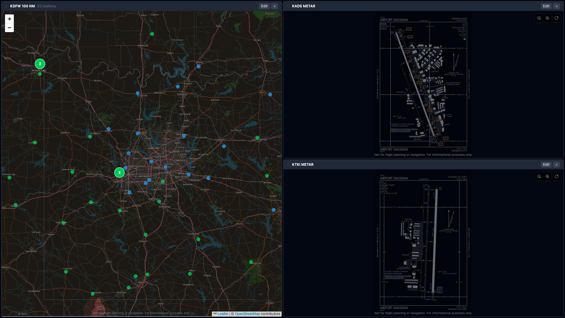 A DFW radius map (left) with two METAR detail panes (right) showing airport diagrams, wind info overlays, and crosswind panels for KADS and KTKI.
Layer 1 — Airport Diagram
An FAA airport diagram fills the background (when available). Controls in the top-right corner let you:
- Zoom (−/+) — Scale from 0.5x to 3.0x
- Rotate — Cycle through 0°, 90°, 180°, 270°
If no diagram is available, a placeholder is shown.
Layer 2 — Wind Particle Animation
Animated particles flow across the diagram in the current wind direction, giving an instant visual read on conditions.
Layer 3 — Wind Info Overlay (top-left)
Displays key weather data in a compact, expandable panel:
Collapsed view:
- Wind direction, speed, and gusts
- Flight category badge
- Day/night indicator
- Observation age
Expanded view (click to toggle):
- Full airport name
- Favorite star
- Frequency (ATIS / AWOS / CTAF)
- Temperature and dewpoint
- Altimeter setting
- Sunrise and sunset times
- Observed N min ago · Updated HH:MMZ — the bottom line shows both the METAR observation age (how old the data is) and the page refresh time (when MetarBoard last successfully fetched). Both render even when the METAR is stale, so you always know whether the page itself is still polling.
Layer 4 — Crosswind Panel (bottom-left)
Calculates headwind and crosswind components for every runway at the airport:
- Runways sorted by best headwind (most favorable first)
- Crosswind direction shown as L (left) or R (right)
- Gust components shown when applicable
- Calm/variable wind conditions clearly indicated
Click to expand or collapse. Auto-collapses when there are more than 4 runways.
Layer 5 — Trend Charts (bottom-right) (Pro)
Three canvas-drawn sparkline charts showing the last 12 hours of:
- Ceiling (feet AGL)
- Visibility (statute miles)
- Wind Speed (knots, with gust overlay)
Each data point is color-coded by its flight category, making it easy to spot deteriorating or improving conditions at a glance.
5. Editing & Customizing Panes
Edit Mode
Click the pencil icon on any pane header to open its edit panel. From here you can:
- Change the view type — Radius, Country, or METAR Detail
- Configure the view:
- Radius: Enter an ICAO code and set the radius (NM)
- Country: Select from the dropdown
- METAR Detail: Enter an ICAO code
- Set a pane title — the title defaults to an automatic name like “KTKI 20 NM”; type your own (e.g., “Prosper Area”, “Home Airport”) and it sticks even when you later change the view or pan elsewhere. Clear the field to go back to the automatic name. Custom titles carry through saved dashboards, share links, and TVs.
- Toggle wind animations on or off
- Click Apply to save changes
ICAO codes must be 3–4 alphanumeric characters (e.g., KJFK, EGLL, YSSY).
Adding & Removing Panes
- Click + (Add Pane) in the toolbar to add a new pane (up to 2 for free users, 6 for Pro).
- Click the × button on a pane header to remove it.
- A 5-second undo toast appears at the bottom of the screen after removing a pane — click Undo to restore it.
Reordering Panes (Pro)
Hover over a pane header to reveal the grip handle (⠿). Click and drag to swap positions with another pane. Visual feedback shows the source pane fading and the target pane highlighted with a blue ring.
Auto Layout
Panes automatically arrange in an optimized grid:
| Panes | Layout | Example |
|---|---|---|
| 1 | Full screen | |
| 2 | Side by side | |
| 3 | 1 large left + 2 stacked right | 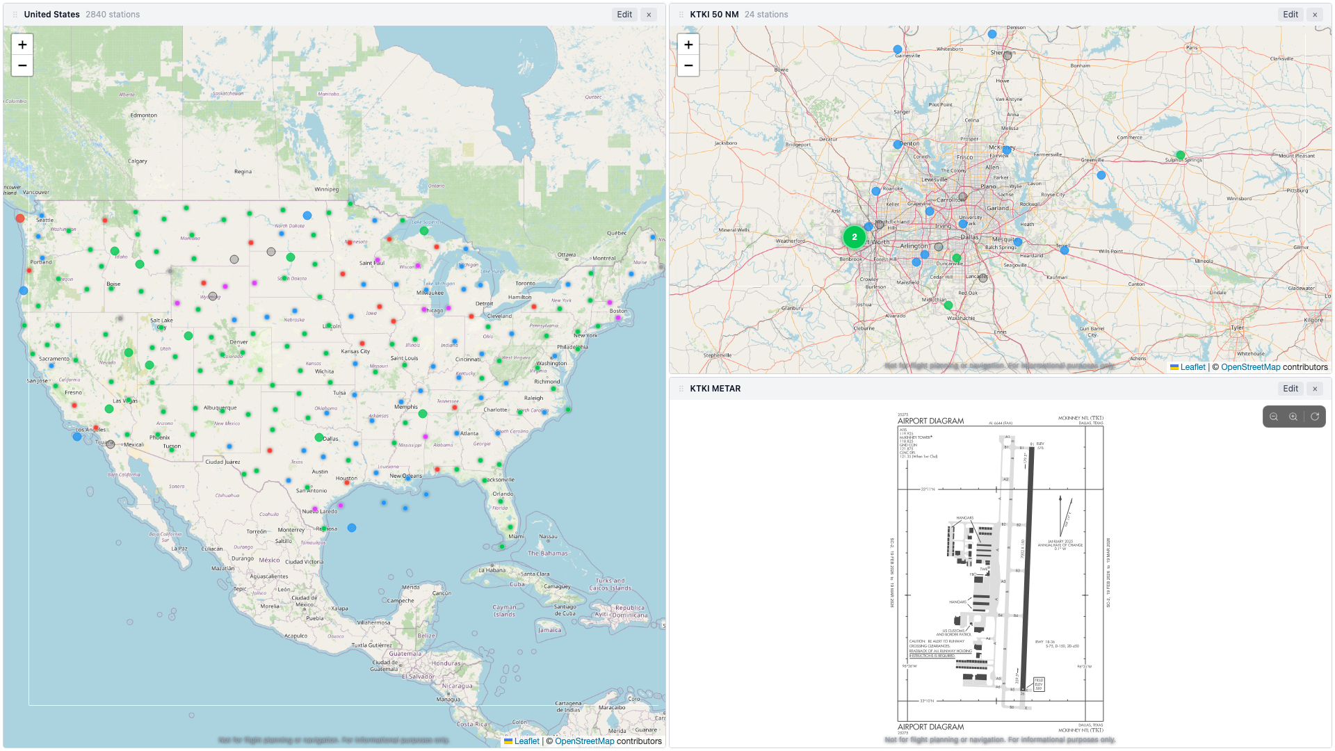 |
| 4 | 2 × 2 grid | — |
| 5 | 3 top + 2 bottom | — |
| 6 | 3 × 2 grid | 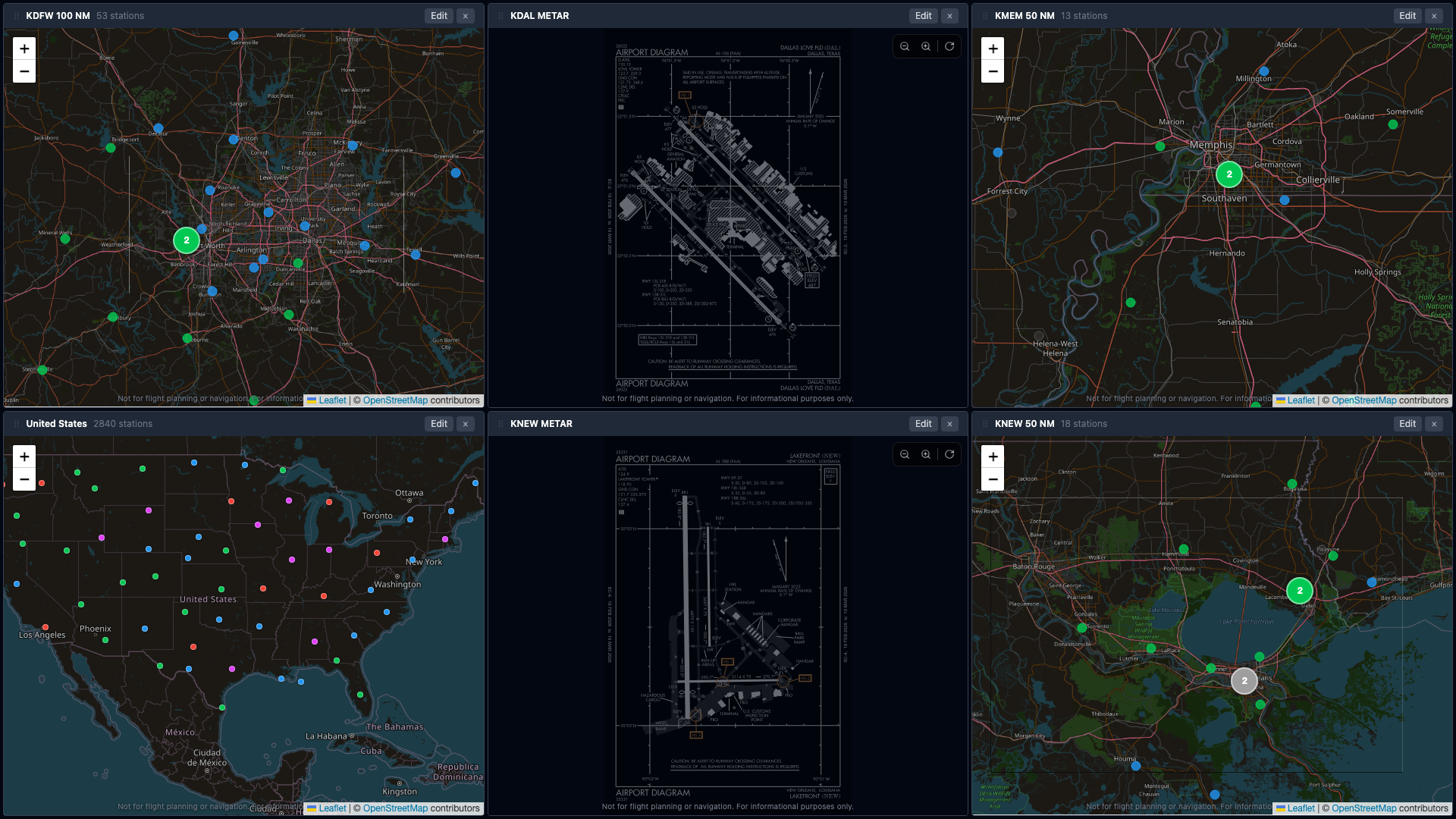 |
Three-Pane Layout
Three-pane layout in light mode: US country view (left), DFW radius view (top-right), and KTKI METAR detail with airport diagram (bottom-right).
Six-Pane Layout
Maximum six-pane layout in dark mode — three map views and two METAR detail panes with airport diagrams, plus a US overview. This is the Pro layout at full capacity.
Locking
Click the lock icon in the toolbar to lock your dashboard. When locked, edit controls, remove buttons, and drag handles are hidden — preventing accidental changes while you’re just monitoring weather.
6. Dashboard Templates
Click Templates in the toolbar to browse pre-built dashboard layouts.
- Category filters let you narrow by region or use case
- Click a template card to preview its description and pane count
- Click Apply to replace your current dashboard with the template
- Some templates are marked Pro and require a trial or subscription
- The Live Traffic category showcases the ADS-B traffic layer (see Live Air Traffic)
After applying a template, you can freely edit individual panes to customize the layout.
7. Saving & Loading Dashboards (Pro)
Saving
- Click Save in the toolbar.
- Enter a name for your dashboard.
- Choose Save to overwrite the currently loaded dashboard, or Save as New to create a separate copy.
Your dashboards are stored in your account and accessible from any device.
Loading
- Click Load in the toolbar.
- Browse your saved dashboards (each shows its pane count).
- Click a dashboard to load it.
8. Sharing Dashboards
Click Share in the toolbar to generate a shareable URL.
- The URL encodes your complete pane configuration and theme preference.
- A short link is generated automatically (when available).
- The link is copied to your clipboard with a confirmation toast.
- Anyone who opens the link sees your exact dashboard layout — no account required to view.
Embedding in a Blog or Site
Append ?embed=1 to any share URL to strip the toolbar and onboarding overlays for a clean iframe-friendly view. Useful for embedding a live dashboard in a blog post, briefing page, or training site.
<iframe src="https://metarboardpro.com/?embed=1#share=<your-share-hash>"
        width="100%" height="600" frameborder="0"></iframe>
The embedded view still polls live data and remains fully interactive.
9. Favorites
Adding a Favorite
Click the star icon (☆) on any station popup or in the wind info overlay of a METAR detail pane. The star fills (★) to confirm. You can save up to 20 favorites.
Using Favorites
Click Favorites (★) in the toolbar to see your list:
- Each favorite shows the station’s ICAO code
- Click ”+ Pane” next to any favorite to instantly open a METAR detail pane for that station
- Favorites sync across all open tabs in real time
Removing a Favorite
Click the filled star (★) on the station popup or wind info overlay to unfavorite.
10. Weather Alerts
MetarBoard Pro can notify you when flight conditions change at your favorite airports.
Setup
- Add at least one station to your favorites.
- Click the bell icon in the toolbar.
- Toggle alerts On.
- Grant browser notification permission when prompted.
How It Works
- MetarBoard monitors your favorited stations in the background (every 2 minutes for Pro, 5 minutes for free).
- When a station’s flight category changes (e.g., VFR → MVFR, IFR → VFR), you receive a browser notification.
- Alerts fire on any category change — no threshold configuration needed.
Requirements
- At least one favorited station
- Browser notification permission set to Allow
- MetarBoard Pro must be open in a browser tab
If notifications are blocked: Click the lock/info icon in your browser’s address bar, find “Notifications,” and set it to “Allow.”
11. Live Air Traffic (ADS-B)
Map panes can overlay live aircraft positions from the ADS-B transponders that most powered aircraft broadcast. Watch airliners stream into a hub, follow the flight-school pattern at your home field, or leave it running on a TV.
Safety note: Traffic display is informational only. Positions can be seconds to a minute old, some aircraft do not appear at all, and coverage varies by region. Never use MetarBoard Pro for traffic avoidance or navigation.
Enabling Traffic (Pro)
- Click Edit on any map pane (radius or country view).
- Check the Traffic checkbox and click Apply.
- Aircraft appear within a few seconds. The setting saves with your dashboard, so saved and shared layouts keep it.
The map attribution line shows the data sources (adsb.fi for positions, VRS standing-data for routes) whenever the layer is active.
Reading the Icons
| Icon | Meaning |
|---|---|
| Small straight-wing silhouette | General aviation / light aircraft |
| Swept-wing silhouette | Airliner |
| Larger swept-wing silhouette | Heavy (widebody) |
| Rotor-cross symbol | Helicopter |
| Small round dot | Shown instead of silhouettes when a pane has very many aircraft in view |
- Icons rotate to the aircraft’s actual track and glide smoothly between position updates.
- A faint blue trail behind each aircraft shows where it has recently been.
- Positions refresh every 5–20 seconds depending on how far the pane is zoomed out.
- If a pane is zoomed out wider than traffic coverage (roughly a multi-state view), the layer pauses and shows “zoom in to show traffic.”
Aircraft Data Labels
Zoom a traffic pane in to roughly metro scale or closer and aircraft grow data labels — a small chip above each plane showing its callsign, altitude (in hundreds of feet, with a ↑/↓ climb or descent arrow), ground speed, and, when known, its route (e.g., KDFW→KJFK).
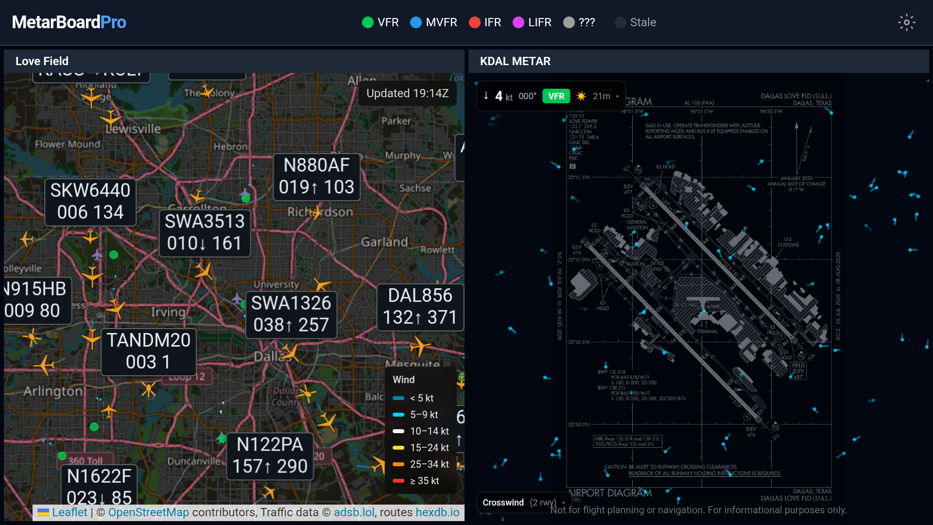 Labels over the Dallas metro on a TV. Labels are automatically spaced so they never overlap — in a busy patch of sky, the nearest aircraft gets the label and its neighbors stay as plain silhouettes (click any unlabeled plane for its popup).
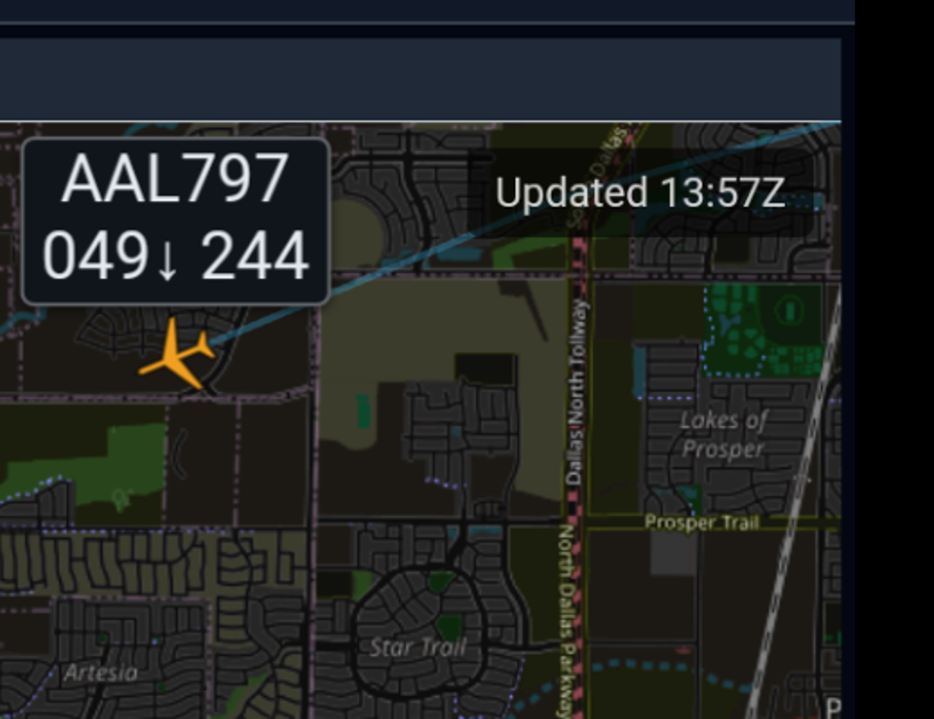 A label up close: callsign, altitude in hundreds of feet with a descent arrow, and ground speed — this one is descending through 4,900 ft at 244 knots.
A few behaviors worth knowing:
- Labels appear when you zoom in, disappear when you zoom out, and never show in dot mode. If you don’t see labels, zoom in a step or two.
- Not every plane gets a label in dense airspace — that’s deliberate. Labels keep a minimum spacing so they stay readable instead of piling into an unreadable stack.
- On TVs, labels rotate. When there are more aircraft than labels, the TV periodically moves labels to different planes (roughly every other update), so a kiosk viewer gradually sees more of the traffic identified. On the web, labels stay put — click planes for details instead.
- Pattern traffic gets label priority. With Pattern mode on, the blue-highlighted aircraft in the pattern are favored when labels are assigned — ideal for a pattern-watch pane where the touch-and-go traffic is what you care about.
- Route lines come from a community database and occasionally lag reality for reused airline callsigns.
The Aircraft Popup
Click any aircraft for a live-updating popup:
- Callsign (or transponder code when no callsign is broadcast)
- Type (ICAO code, e.g., B738, C172) and Route (origin → destination, when known — mostly airline flights)
- Altitude, plus height above the pane’s center airport when one is set
- Ground speed, vertical speed, track, and the age of the last position report
Traffic Controls (bottom-left of the pane)
- Hide ground traffic — on by default. Uncheck to see taxiing aircraft, runway crossings, and hold-short traffic when zoomed into an airport.
- Pattern mode (radius views) — highlights aircraft within ~10 NM of the center airport below ~4,000 ft AGL in blue with trails, and fades everything else. Perfect for watching the pattern at your home field. When nobody qualifies, all traffic displays normally until someone enters the pattern.
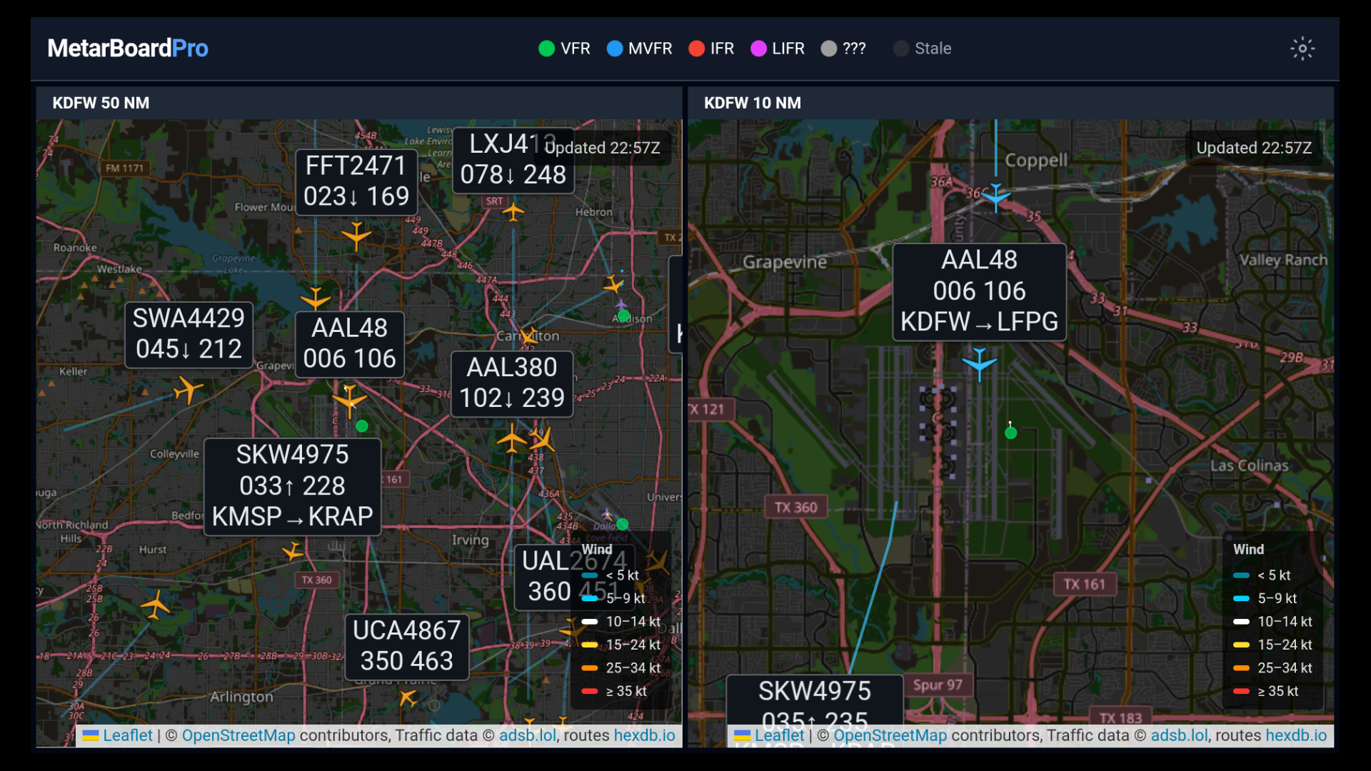 Pattern mode on a Fire TV: the right pane highlights low-altitude traffic at DFW in blue with trails — here an American departure climbing out with its route label — while the left pane shows the wider arrival picture. Pattern aircraft also get priority for data labels.
Traffic on TV
TVs display traffic but don’t configure it: enable Traffic on the dashboard on the web, then share it to the TV via QR pairing. The TV renders the layer exactly as configured — the on-screen sub-controls are hidden since a remote can’t reach them.
Quick Start: Traffic Templates
The Templates browser has a Live Traffic category with ready-made dashboards — Atlanta Traffic Watch, DFW Traffic Watch, and LAX Traffic Watch — each pairing a wide labeled-traffic view with a close-in pattern view of the same airport.
12. Accounts & Subscription Tiers
Tier Comparison
| Feature | Anonymous / Free | Trial (14 days) | Pro |
|---|---|---|---|
| Map panes | 2 | 6 | 6 |
| Station popups | Basic | Full decode | Full decode |
| Edit pane views | — | Yes | Yes |
| Save & load dashboards | — | Yes | Yes |
| 12-hour trend charts | — | Yes | Yes |
| Dark / light theme | — | Yes | Yes |
| Fullscreen / kiosk mode | — | Yes | Yes |
| Fast refresh (2 min) | — | Yes | Yes |
| Drag-to-reorder panes | — | Yes | Yes |
| Weather alerts | Basic | Full | Full |
Creating an Account
- Try any Pro feature — the Pro Feature prompt appears.
- Review and agree to the Privacy Policy and Terms of Service (checkboxes).
- Click Sign In for Free Trial.
- Choose Email/Password or Google sign-in.
- Your account is created with a 14-day free trial and full Pro access.
Upgrading to Pro
When your trial expires (or if you’re on the free tier):
- Click your user icon → Upgrade to Pro, or try any Pro feature.
- If you haven’t previously accepted the Privacy Policy and Terms of Service, you’ll be asked to do so before proceeding.
- Review the pricing:
- $8/month (monthly)
- $72/year (annual — save $24)
- Click Subscribe to complete checkout via Stripe.
Managing Your Subscription
Click your user icon → Manage Subscription to open the Stripe customer portal where you can update payment methods, switch plans, or cancel.
13. TV Apps (Fire TV & Android TV)
MetarBoard Pro is available as a dedicated app for Fire TV and Android TV, turning any television into a live weather board.
Installation
- Fire TV: Search “MetarBoard” in the Amazon Appstore, or visit the Amazon listing
- Android TV: Search “MetarBoard” in the Google Play Store
First Launch
On first launch, a welcome overlay appears with instructions:
- Fire TV: “Press the MENU button on your remote to set up dashboard pairing”
- Android TV: “Long-press OK on your remote to set up dashboard pairing”
Pairing Your TV
- Press the appropriate button on your remote to open the setup screen.
- Set a 4-digit PIN (first time only).
- An artistic QR code appears on screen.
- Scan the QR code with your phone.
- Sign in on your phone and select a saved dashboard.
- Your dashboard loads on the TV — done.
The TV remembers your dashboard across power cycles. To change dashboards, repeat the pairing process.
TV Preview — See It Before You Send It
TVs render your dashboard differently than your desktop browser: panes are shaped for the 16:9 screen, the map zoom is recalculated for the TV’s dimensions, aircraft labels use bigger text and different thresholds, and the toolbar disappears. TV Preview shows you exactly what the television will display — before you send anything.
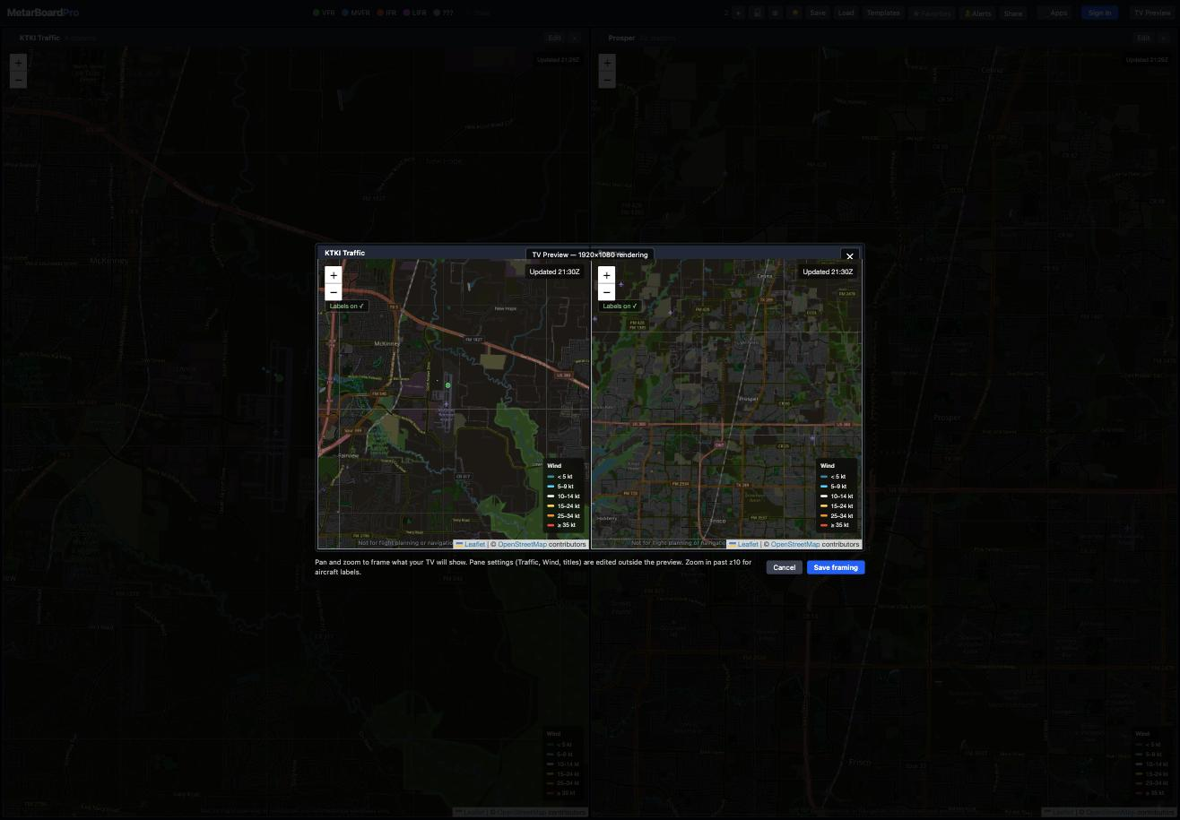 TV Preview: your dashboard rendered in a 16:9 stage exactly as a TV will show it — kiosk chrome, TV label sizing, and all. The bar below the stage holds the instructions and the Save framing / Cancel buttons.
- Click TV Preview in the toolbar (next to Share).
- The preview stage opens, rendering your dashboard with the TV’s rules. The badge at the top confirms you’re looking at the TV rendering, not a resized browser view.
- Pan and zoom right in the preview to frame each pane the way you want the TV to show it. What you frame here is what the TV reproduces.
- Aircraft labels need a closer zoom on TV — each pane has a Zoom to labels button that jumps straight to the zoom where labels appear (it turns into a green Labels on ✓ once you’re there).
- Click Save framing to keep your changes, or Cancel (or Esc, or ✕) to discard them — canceling restores every pane exactly as it was before you opened the preview.
- Share the dashboard to your TV as usual — it will match the preview.
Note: pane settings (Traffic, Wind, titles) are edited outside the preview with each pane’s Edit button. The preview is for framing — position and zoom.
Labels rotate between aircraft inside the preview just like they do on a real TV — that’s the TV behavior being previewed faithfully, not a glitch.
TV Display
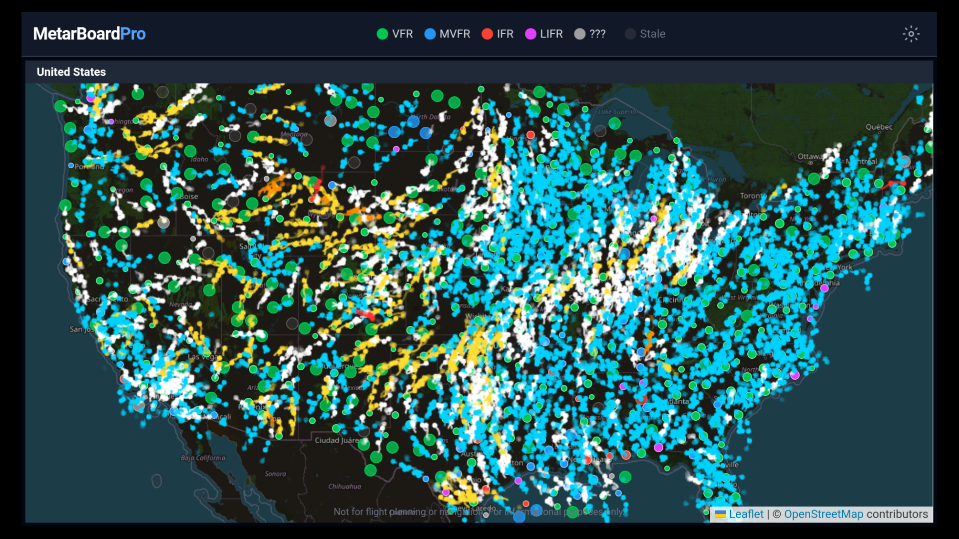 MetarBoard Pro on Fire TV — full-screen kiosk mode with the flight category legend in the toolbar and wind arrows across the US. Note the compact, TV-optimized layout.
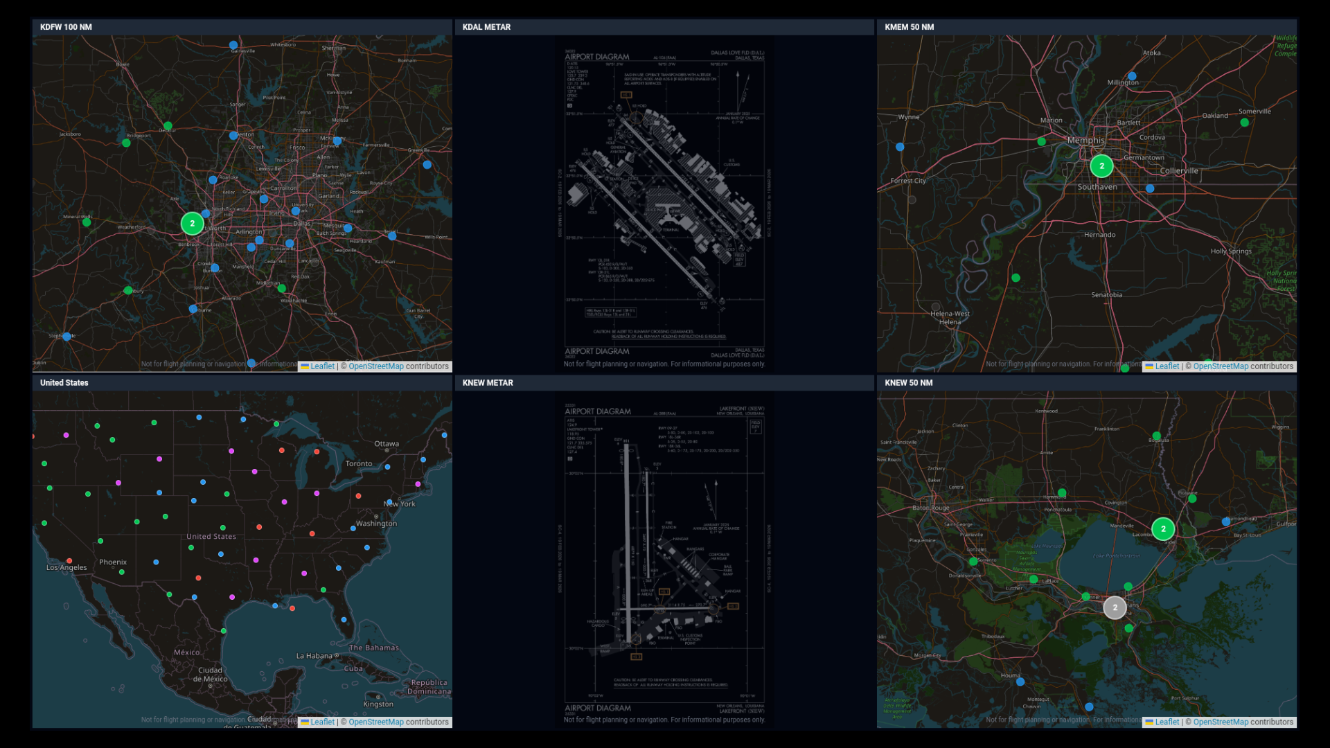 Six-pane layout on Fire TV — three map views and two METAR detail panes with airport diagrams, all rendered in kiosk mode without edit controls.
TV-Specific Behavior
- Kiosk mode: No toolbar buttons or pane edit controls — clean, full-screen display.
- Compact clusters: Small colored dots without numbers for a cleaner look.
- Auto-collapsed overlays: Wind info and crosswind panels start collapsed to maximize map visibility.
- Wider wind arrows: Wind particles appear at zoom level 4 (vs 6 on web) for better visibility on large screens.
- PNG diagrams: Airport diagrams render as images (not PDFs) for TV WebView compatibility.
- Favorites hidden: Star buttons are not shown on TV (no practical way to interact with them via remote).
Disabling Wind Animation (?nowind=1)
For low-power TVs or capture scenarios where wind particle animation reads as flicker (e.g. sampling at 30-second intervals for a timelapse), append ?nowind=1 to your dashboard URL. The dashboard renders normally but skips all particle/arrow rendering globally. The refresh indicator remains visible, so kiosk viewers still know the page is live even with no other on-screen motion.
Trial Expiration on TV
If your trial expires while a dashboard is displayed on TV, a yellow banner appears:
“Trial expired — re-pair from metarboardpro.com to continue”
The dashboard continues to display underneath. To restore full access, upgrade your account on the web and re-pair.
14. Mobile View
On screens narrower than 640px, MetarBoard Pro switches to a read-only reference view:
- Single-column layout with panes stacked vertically
- Minimal header (logo + theme toggle)
- No editing, reordering, or adding panes
- Informational banner: “View-only on mobile. Create dashboards on desktop or open a shared link.”
Shared dashboard links work on mobile — you’ll see the full layout in read-only mode.
For full mobile wind analysis, check out MetarBoard Wind — our companion app designed specifically for phones.
Appendix A — Flight Categories
Flight categories are determined by ceiling and visibility per FAA standards:
| Category | Ceiling | Visibility | Color |
|---|---|---|---|
| VFR | ≥ 1,000 ft AGL | ≥ 5 SM | Green |
| MVFR | 500–999 ft | 3–4 SM | Blue |
| IFR | 200–499 ft | 1–2 SM | Red |
| LIFR | < 200 ft | < 1 SM | Magenta |
| UNKNOWN | Data missing | Data missing | Gray |
The worse of the ceiling or visibility condition determines the category. For example, VFR ceiling with IFR visibility = IFR.
Stale Observations
Some stations report infrequently or go offline temporarily. An observation older than 65 minutes is marked stale with a faded gray appearance. On detail panes, the wind info overlay turns red and shows “STALE” in place of the observation age. Stale stations are also excluded from cluster color aggregation, so a single old observation can’t paint a regional cluster the wrong color. This is normal station behavior, not a system error.
Appendix B — Keyboard & Controls Reference
Map Controls
| Action | Mouse | Touch |
|---|---|---|
| Pan | Click + drag | Drag |
| Zoom in | Scroll up / double-click | Pinch out / double-tap |
| Zoom out | Scroll down | Pinch in |
METAR Detail Pane Diagram
| Action | Control |
|---|---|
| Zoom in | + button (top-right) |
| Zoom out | − button (top-right) |
| Rotate 90° | Rotate button (top-right) |
| Expand/collapse wind info | Click the overlay |
| Expand/collapse crosswind | Click the panel header |
TV Remote
| Action | Fire TV | Android TV |
|---|---|---|
| Open setup / pairing | MENU button | Long-press OK |
| Navigate | D-pad | D-pad |
Appendix C — Troubleshooting
”Notifications blocked”
Click the lock or info icon in your browser’s address bar, find “Notifications,” and change the setting to Allow. Then toggle alerts off and on again in MetarBoard Pro.
Stale METAR data at a station
MetarBoard refreshes data five times per hour on a smart schedule aligned with typical METAR publication times. Some stations have natural reporting gaps of 2+ hours. If a single station appears stale, it’s likely the station itself — not a refresh issue.
Google Sign-In not working
Make sure you’re accessing MetarBoard Pro at metarboardpro.com (not a preview URL). Google OAuth only works on authorized domains.
Shared link shows wrong theme
The shared URL encodes the theme at the time of sharing. If the recipient prefers a different theme, they can toggle it after loading (Pro feature).
TV dashboard not updating
The TV uses the same refresh polling as the web app. If data appears stuck, try re-pairing the TV from your phone to push a fresh dashboard URL. The TV clears its WebView cache on every page load.
Airport diagram not loading
Airport diagrams are sourced from FAA d-TPP publications and are available for US airports. International airports or very small US fields may not have diagrams available.
MetarBoard Pro is built by SnickityBit. For support, visit metarboardpro.com.
Companion app: MetarBoard Wind — real-time wind visualization for iOS and Android.